
One of my interests is looking at data, representing it and looking for trends. With WSPR the data it provides is great for doing looking at trends to do with the propagation of radio waves. Here, during the good HF conditions experienced over November 2011 I left WSPR receiving constantly as I often do. The purpose being to collect enough data to enable me to observe the trends in propagation.
You may also be interested in my time-lapse videos of WSPR on YouTube: TimeLapse WSPR Reception and TimeLapse WSPR Map
Time of Day
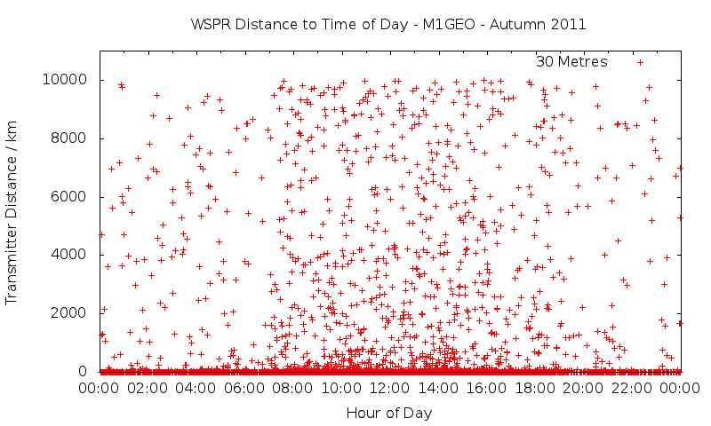
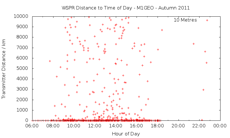
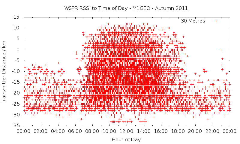
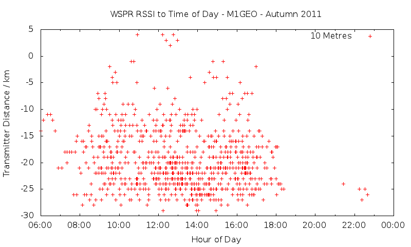
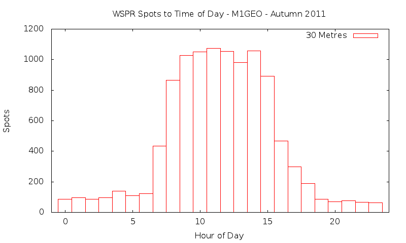
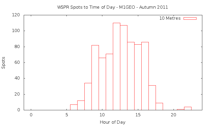
In radio communications, especially my hobby, Ham Radio, the aim of the game is to get your signal to go as far as possible. Signal propagation is influenced by layers of the Earth’s atmosphere, amongst other factors, which change throughout the day. These first plots aim to show how the distance of communication changes with time of day. These results have been aggregated over time (6 weeks for 30 metres, 1 week for 10 metres), and then I have plotted using gunplot.
 |
 |
 |
 |
 |
 |
Click an image to get more information, and follow the link on the details page for high-resolution images.
As I had expected, distance is normally distributed around mid day – this can be seen from the bottom histogram plots. The first two rows show the raw plots of distance (top row) and received signal strength (middle row). The raw distance plots show many points where distance is very low, and these are uniformly distributed in time – these, I suspect, are from ground-wave radiation. Ground-wave radiation occurs when a receiver and a transmitter close together (hence the low distance); the receiver hears the transmitted signal without any reflections from the Earth’s atmospheric layers and is therefore unaffected by time.
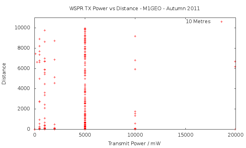
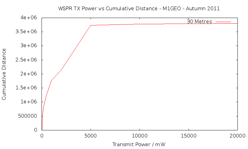
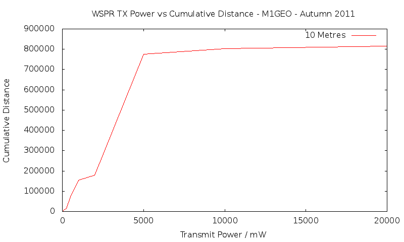
Transmitter Power
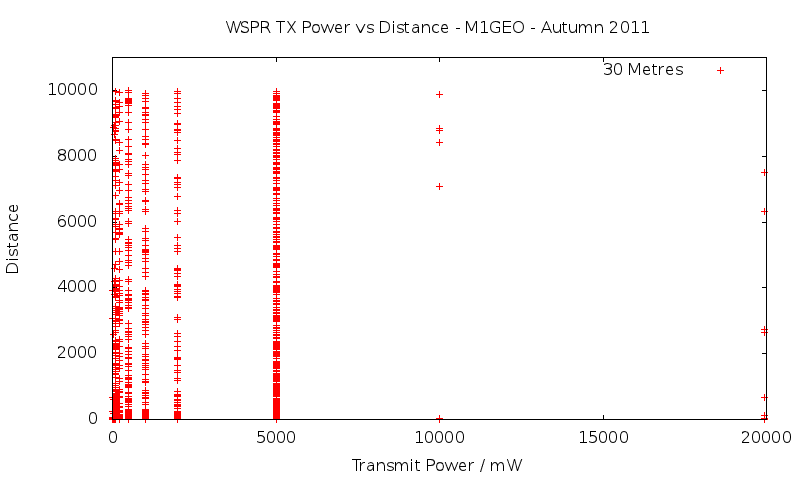
The next thing I was curious to see what how did the transmitter power effect the distances workable? The first two plots show the raw data, linear transmitter power (in milliwatts) against distance (in kilometres). The power is quantised in steps by the WSPR program and set in dB. This was simply converted to milliwatts by the formula:

 |
 |
 |
 |
Click an image to get more information, and follow the link on the details page for high-resolution images.
These plots didn’t really show very much useful information. We can see that the majority of people are using less than 5000 mW, but this is not really what we set out to see. It does show however, that the higher the transmitter power the larger the probability the transmitter will make the longer distance – but this stands to reason!
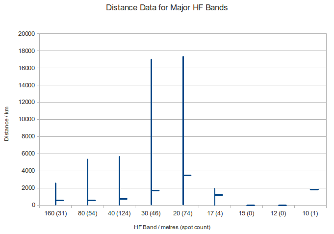
Bands
Each frequency range (here, referred to by band in wavelength) has specific properties when it comes to distance, time of contact, etc. We looked briefly at how the time of day effects the chances of a distant signal reception; this graph below shows the distance data for each band. It is important to note the number of spots on a given band, and understand that this skews results considerably. The stocks style of representing this data is useful, but may not necessarily be initially understood – the line runs from the smallest distance to the largest, the bar out is the average (mean) distance for the number of spots (bracketed next to the band on the X axis).
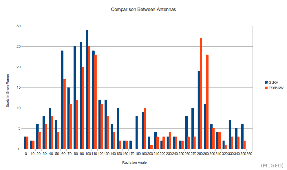
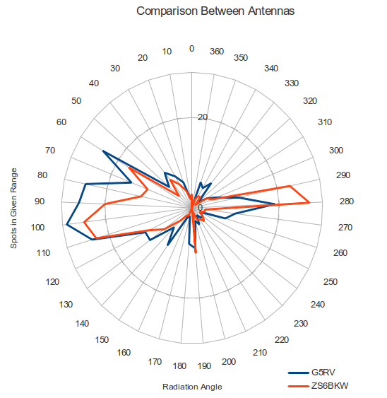
Comparison of Antennas
Spurred on my fellow amateur’s interests in these ideas, I decided to put a bit more effort into this page. The next thing I decided to do was to compare two antennas. The two antennas here are the G5RV and ZS6BKW, which are very similar. I will also compare my G5RV to the Delta Loop, and to a mobile vertical whip antenna. The graphs, though a little awkward, show the number of spots for a given bearing from my house, grouped into sets of 10 degrees. The left shows more of a histogram, while the right shows the same data in polar plot form. It is important to note that the polar plot’s magnitude shows frequency of spots, and not distance.
 |
 |